How Colors in Interior Design Affect Mood and Productivity
Have you ever walked into a bright red room and felt your heart start to race just a little bit faster? Or perhaps you’ve stepped into a soft, pale blue bedroom and felt an immediate wave of relief wash over you? It isn’t just your imagination. The colors on our walls do much more than just look pretty; they speak a silent language directly to our brains.
For decades, psychologists have studied how different light wavelengths affect our mood, our heart rate, and even how quickly we get our work done. In the world of interior design, color is one of the most powerful tools we have to change how we feel about our lives. Whether you are trying to ace a big project at work or simply trying to find a little peace at the end of a long day, the paint you choose can be the secret to your success.
The Feeling of a Room
The moment you enter a space, your eyes send a signal to a part of your brain called the hypothalamus. This area is responsible for releasing hormones that control your sleep, your hunger, and your temperature. Because different colors have different wavelengths, they trigger different chemical reactions.
A bright yellow kitchen might make you feel hungry and energetic in the morning, while a dark navy study might make you feel serious and quiet. Colors aren’t just for decoration; they are sensory experiences. By understanding the “personality” of each color, you can stop picking paint based on what is trendy and start picking it based on the mental state you want to achieve.
Colors That Help You Get to Work
When it comes to productivity, blue is the undisputed king. Most offices use blue because it is the color of logic and communication. It has a calming effect on the body, lowering your pulse and helping you stay focused on a single task for a long time. If you have a job that requires deep concentration—like writing, coding, or accounting—blue is your best friend.
On the other hand, if your work requires you to solve creative problems or come up with new ideas, green is a better choice. Green is the color of growth and nature. It reminds our brains of being outdoors, which reduces eye strain and helps us feel “refreshed.” This is known as the “biophilia effect.” It allows the brain to relax just enough to let new, creative thoughts bubble to the surface.
Colors for a Busy Brain
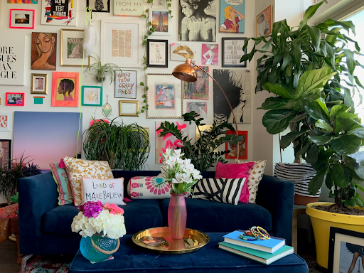
Some colors are like a loud shout. Red and orange are high-energy colors that demand your attention. They increase your physical energy and can even make you move faster. While this is great for a gym or a fast-food restaurant, it can be a disaster for a quiet workspace. If you spend eight hours a day in a bright red room, your brain stays in a state of “high alert,” which can lead to burnout very quickly.
When the environment feels too loud or distracting, it can be hard to tell if your stress is coming from your work or your surroundings. During these times, some people turn to mental health assessment apps to check in on their stress levels and see if their environment is playing a role in their anxiety.
If you find that you are constantly distracted or “fidgety,” it might be because your room is too visually busy. Using “warm” colors in small doses—like a single orange chair or a piece of art—is usually better than painting the whole room a fiery shade.
Creating a Space to Unwind
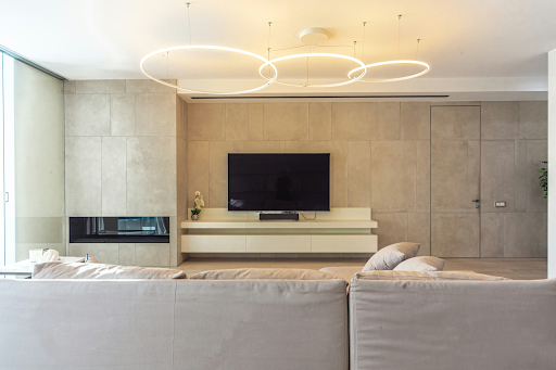
After a stressful day, your brain needs a place to “power down.” This is where neutrals and earth tones come in. Colors like tan, soft grey, and warm brown are “grounding.” They don’t demand anything from your eyes, which allows your mind to stop processing information and start resting. These shades “turn down the volume” of the world outside.
Interestingly, pink is also a powerful tool for relaxation. There is a specific shade called “Cool Down Pink” that has been used in high-stress environments to help people feel less aggressive. Soft, dusty pinks can make a room feel warm and safe, almost like a hug. It is an excellent choice for a bedroom or a reading nook where the only goal is to feel completely at peace.
The Problem with “Too Plain”
While too much color can be distracting, having no color at all can be just as bad. Many modern offices and homes are painted entirely in “sterile” white or grey. While this looks clean in photos, it can actually lead to feelings of boredom and loneliness. All-white rooms provide very little “sensory input,” which can make the brain feel under-stimulated and tired.
The trick is finding the right balance. You want enough color to keep your brain “awake” and interested, but not so much that you feel overwhelmed. Adding a soft blue wall to a white room, or putting a green plant in a grey corner, can provide just enough of a “brain boost” to keep you feeling inspired without making the space feel cluttered or messy.
Painting Your Best Life
Choosing a paint color is one of the easiest and cheapest ways to practice self-discovery. It forces you to ask yourself: “What do I need more of in my life right now?” Do you need more energy? More peace? More focus?
Your home should be a tool that helps you become the person you want to be. It shouldn’t just be a place where you keep your stuff; it should be a place that supports your mental health and helps you reach your goals. By picking colors that match your needs, you aren’t just decorating a house—you are designing a better mindset. The next time you pick up a paintbrush, remember that you aren’t just changing the walls; you are changing how you feel about the world.
Read more: Canvas Prints: Transforming Walls into Artistic Expressions
Read more: Interior Remodeling Mistakes Commercial Property Owners Often Overlook
Read more: How Modern Homeowners Are Re-Thinking Comfort, Light, and Space